Simplify or Lose: Why Your Website Might Be Driving Users Away
In the race to impress, many websites end up doing the opposite: they overwhelm.
From cluttered layouts to popups competing for attention, users are often bombarded with too much — too fast. In most cases, it’s not a lack of features that sends people away… it’s too many.
Today’s users are fast, mobile, and distracted. Your website has 5 seconds or less to show value. If your homepage looks like a control panel from a spaceship, they’re gone.
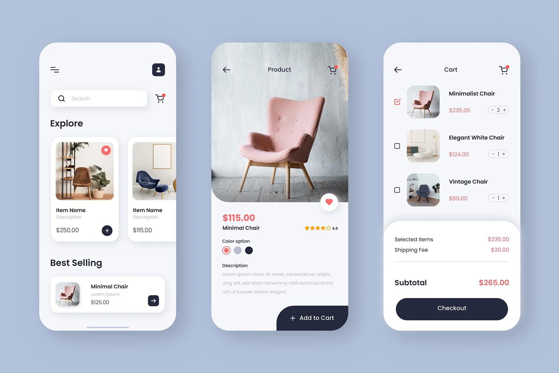
Have a look below, see the simplicity how wins:

The Psychology of Simplicity
People don’t read websites — they scan. And every added decision point, visual block, or message slows them down. As one designer put it:
“We don’t simplify because users are stupid. We simplify because attention is limited.”

Here’s How to Keep It Simple (And Effective):
-
One Message Per Screen
Guide the user, don’t overwhelm them with options. -
Kill the Noise
Remove extra popups, sliders, or conflicting CTAs. -
Simplify Navigation
Less is more. Keep your menu short and clear. -
Use White Space
It gives room for the eyes and brain to breathe. -
Focus on the Journey
Make it clear what action the user should take next.