How the Web Glowed Up
From Blinking Text to Beautiful UX
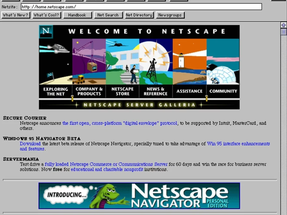
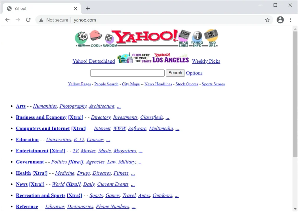
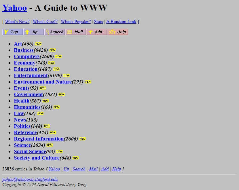
The year is 1999. You open a website, and you’re instantly hit with red and blue text, a blinding yellow background, and — if you’re lucky — a dancing baby GIF or a “Visitor #008312” counter. Life was good.
But… what was happening?
Back then, every website looked like a school project made in Microsoft FrontPage. Fonts were huge, gradients were crimes, and music autoplayed with zero warning. Yet, we loved it. Because it was new. The internet was magic.
The Early Days: Design Was Chaos
-
No UX.
-
No grid systems.
-
Just vibes.
It was the wild west of the web. Everyone experimented. Tables were layout tools. GIFs were emotions. And if your site had a scrolling marquee or a “Best Viewed in Internet Explorer” badge… you were elite.
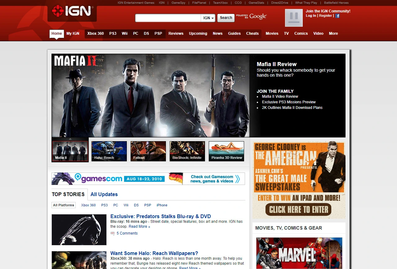
Then Came Structure
Suddenly, we got:
-
CSS
-
Flash (the cool kid… until it wasn’t)
-
Navigation bars that made sense
-
Google — who decided white space is a thing
We slowly moved away from neon disasters and towards cleaner layouts, legible fonts, and a little something called user experience.
Enter the Mobile Era
2007: iPhone drops.
Designers and developers everywhere scream: “How do I make this fit on a tiny screen!?”
Responsive design changed the game.
The web had to adapt — to devices, behaviors, even moods. Suddenly, it wasn’t just about looking cool. It was about feeling smooth. Intuitive. Fast.
Today: Design With Purpose
Now, every pixel is strategic.
We think about:
-
Accessibility
-
Emotion
-
Performance
-
Storytelling
Modern websites are products, not posters. They solve problems. They connect people. They convert.
Check out the oldest 12 websites:
https://www.oldest.org/technology/oldest-websites-still-editing/
